Neutral paint colours look simple on the surface. Soft whites, warm beiges, gentle greys and earthy taupes feel safe, timeless and easy to live with. That is precisely why so many homeowners choose them. However, neutral shades are also where most decorating mistakes happen.
A wrong undertone, poor lighting choice, or lack of contrast can make a home feel dull instead of elegant.
This blog breaks down the most common mistakes people make with neutral paint colours and explains how to avoid them for a home that feels balanced, warm and visually interesting.
A professional home interior designer in Ahmedabad knows that if neutral colours are handled properly, they never appear boring. Instead, they start the process of creating an elegant and adaptable interior.
5 Common Mistakes to Avoid When Choosing Neutral Colours for Walls
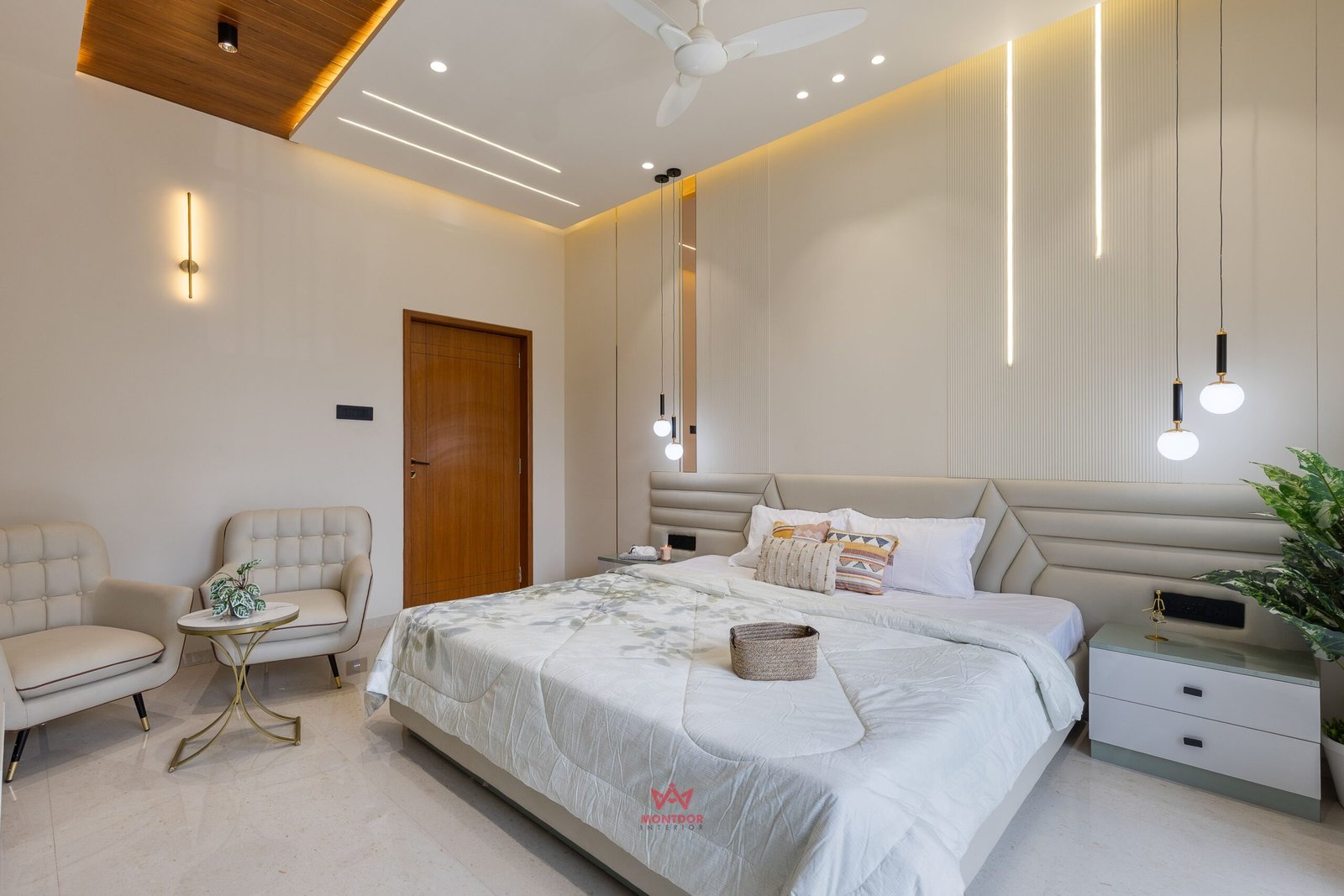
Using One Neutral Everywhere
While a common colour on all walls may be a neutral choice, this can easily lead to a home looking two-dimensional. Beige or grey on all walls can be very dull.
Put neutrals in layers instead. Use the light and medium shades of the same hue. Create contrast with trims, ceilings, or accent walls instead. Such subtlety of detail can easily create motion without the help of bold colours.
Forgetting Texture Completely
Neutral walls without texture can feel lifeless. Texture is what brings warmth to a neutral space.
Use rugs, cushions, throws, wooden furniture, linen curtains and matte finishes to add layers. Even subtle textures like fluted panels or fabric headboards can transform how neutral walls feel. A thoughtful home interior designer in Ahmedabad ensures textures are evenly distributed so the room feels rich, not cluttered.
Ignoring Lighting Effects
Lighting makes a world of difference. While a particular paint colour may seem neutral during the day, it may look dull and greenish at night. In fact, most homeowners overlook this paint testing step.
At all times, it’s essential to note the sample paint under morning, afternoon and night lighting. You don’t want to be surprised by what happens after the last coat of paint. Interior designers take lighting sources into consideration from the first day of designing.
Leaving Neutral Walls Empty
A neutral wall cannot be left alone. It is a canvas.
Bare walls give the appearance of unfinished space. Hang some artwork, mirrors, plants, or distinctive furniture to add some personality. Neutral colours are at their best when complementing other design features.
Mixing Clashing Undertones
Not all neutrals work well together. A warm beige can clash with a cool grey if undertones are ignored. This creates visual discomfort without an obvious reason.
Comparing samples side by side helps identify undertones early. A professional home interior designer in Ahmedabad ensures neutral combinations flow naturally across rooms.
Conclusion
Neutral paint colours can elevate any home when used thoughtfully. To make it sophisticated, some tricks include avoiding the mistakes highlighted above. For professional advice on determining appropriate shades of light-colored paints and how to design them effectively, contact Montdor Interior. The team has experience in providing services of a interior designer in Ahmedabad to enhance ordinary walls to make them look classic and elegant.